Scope of work: UI/UX Design
Developed by: Tasos Maschalidis
Published: TBA

This project is currently under user testing & design iterations. More to be uploaded soon :)
Sudokku is a PaaS (platform as a service) for hosting and deploying web apps utilizing git repositories.
Sudokku has been a happy and rewarding challenge so far, requiring knowledge of technical processes, the creation of a scalable IA, and a proactive approach to organising and conducting fitting user research and testing practices.
As the project had no established user flow on its way to a beta, I collaborated with the development team to conduct user research and a competitive audit, creating an effective user flow within 2 weeks. As the project continues, we are iterating on designs through user testing interviews, challenging our initial assumptions, and proactively addressing user needs that may have been overlooked.

To test our projects viability and prospects we decided on a quick launch to user test, draw initial conclusions about features and our target audience and iterate on the platform features and design.
The Rails Hackathon, on July 29 (not affiliated) was set as a good chance to make a soft public release and enable the rails community to have free hosting on any apps created for the hackathon, for free.
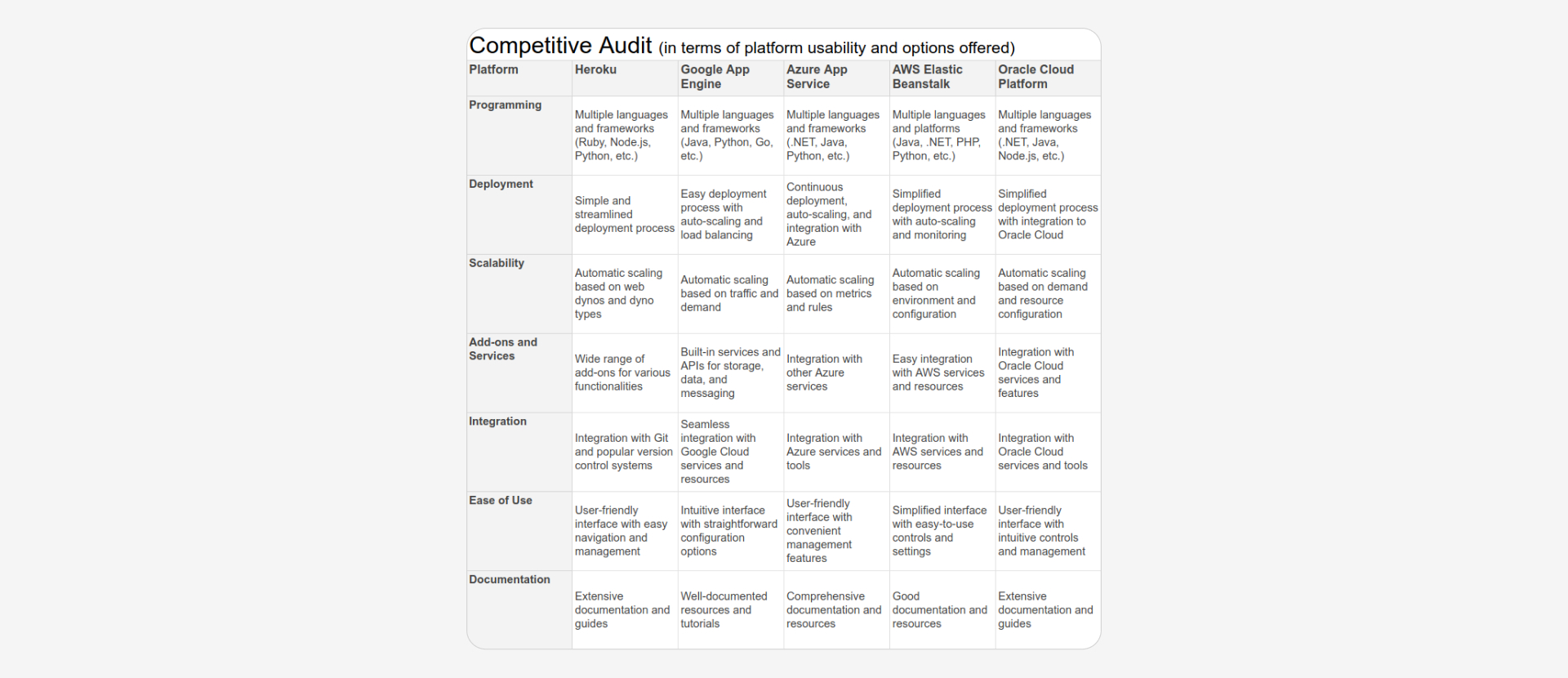
With 3 weeks for the upcoming hackathon, the initial research and design phase focused on competitors' research and information architecture, following a familiar stucture of content, accompanied by a walkthrough for quick onboarding.


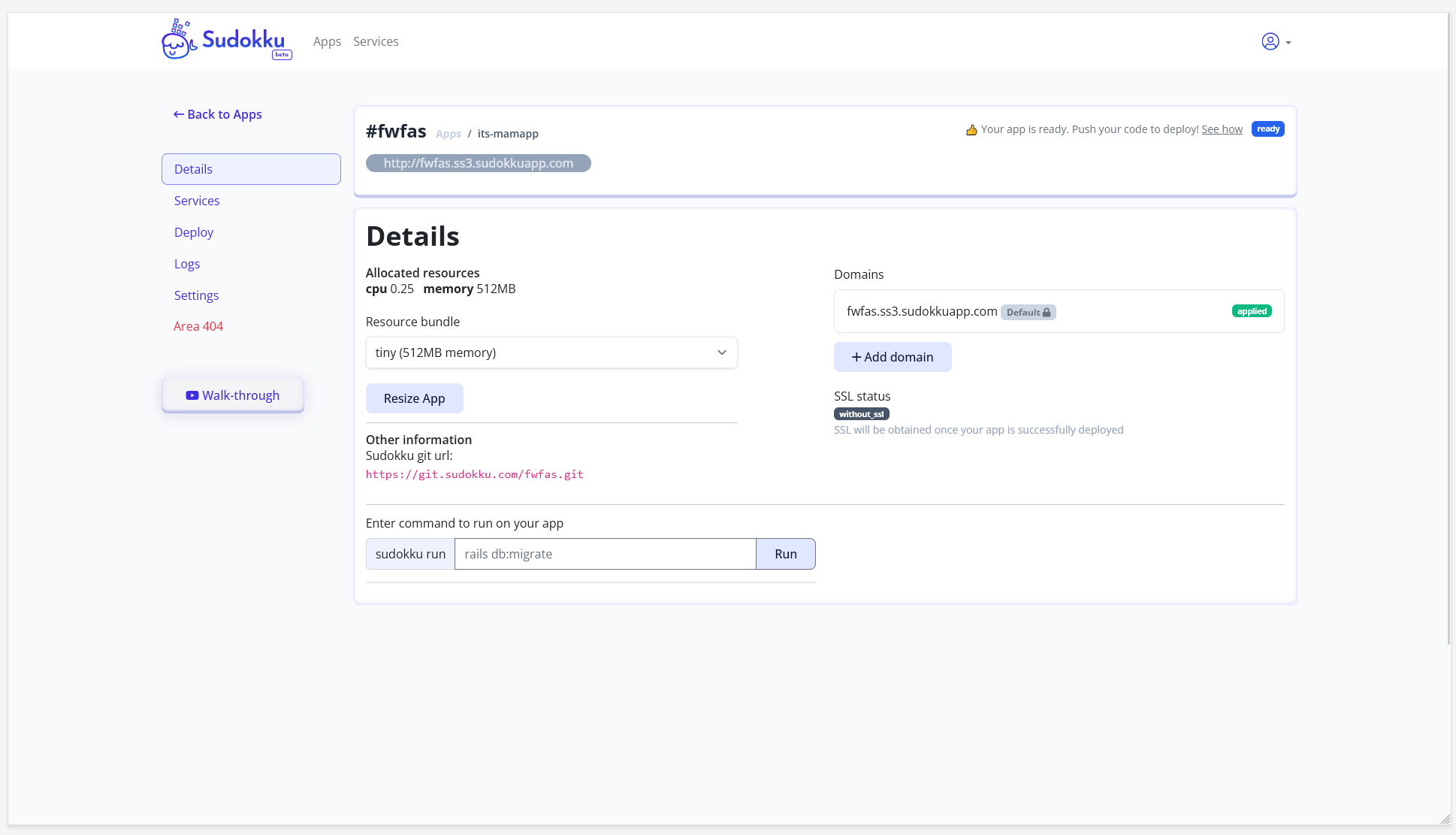
After the release we organized any discovered user feedback and findings and iterated on the first design. You can see an outline of our key takeaways and goals in the following images.
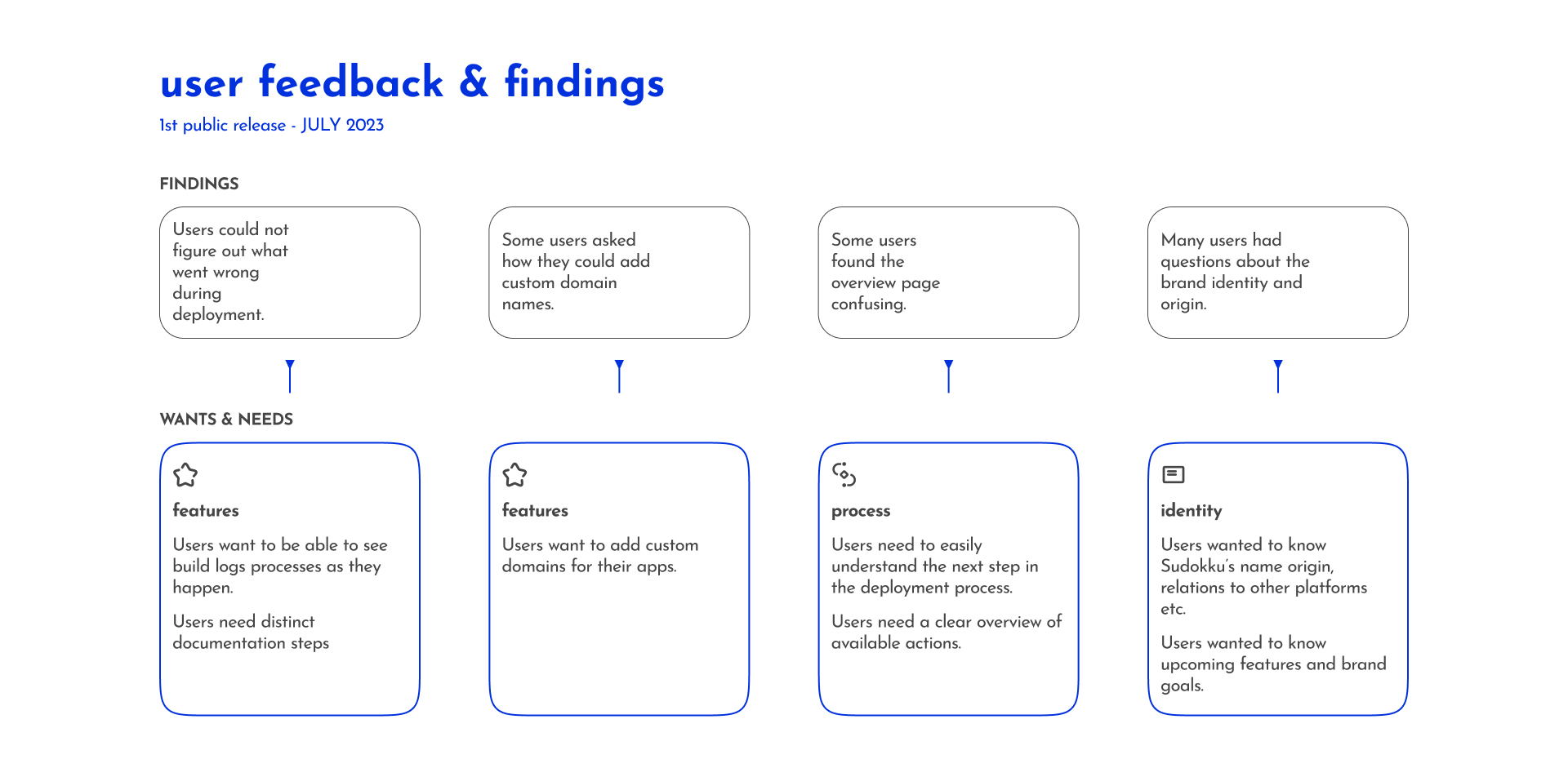

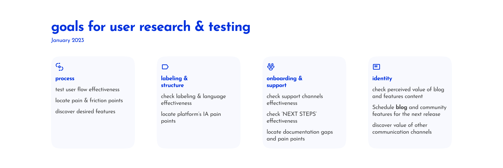

This was our process!
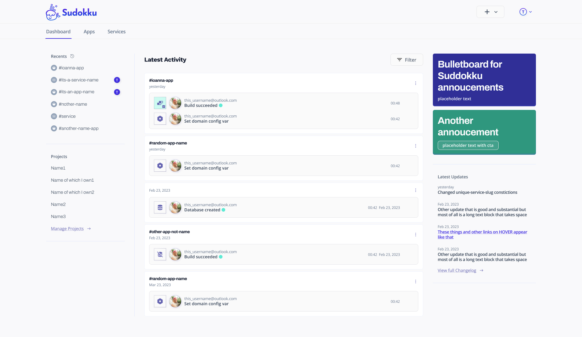
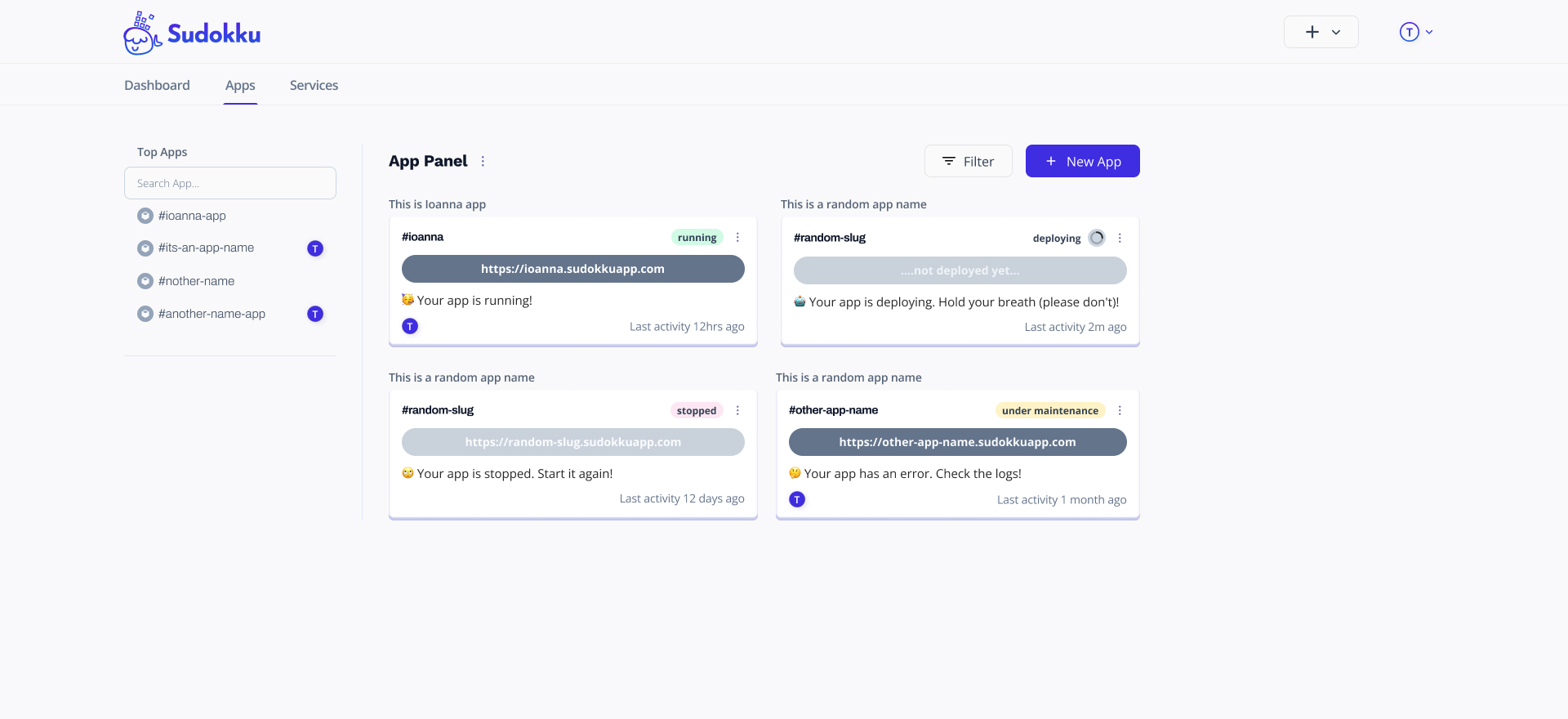
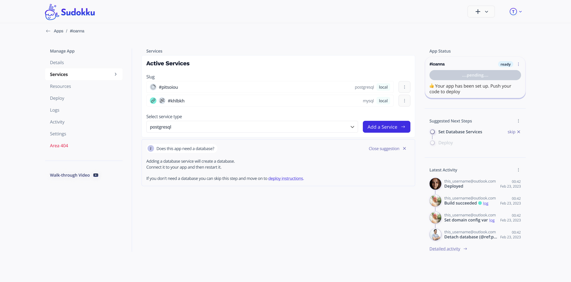
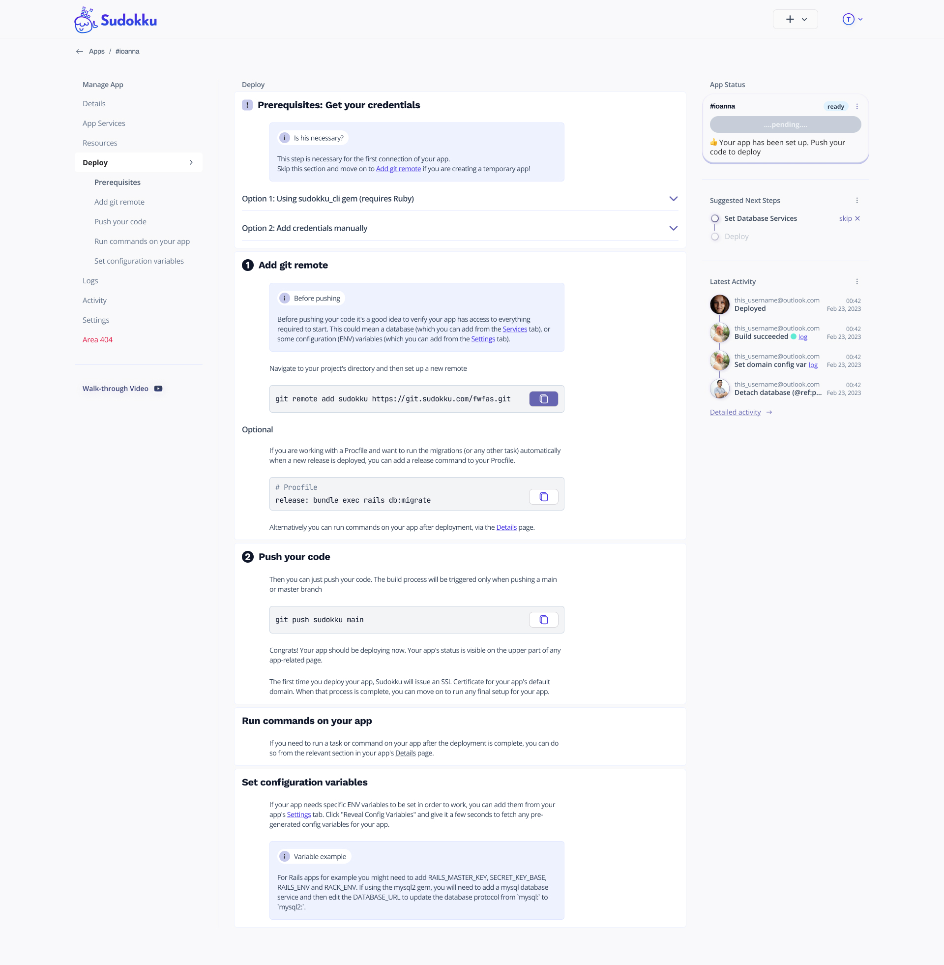
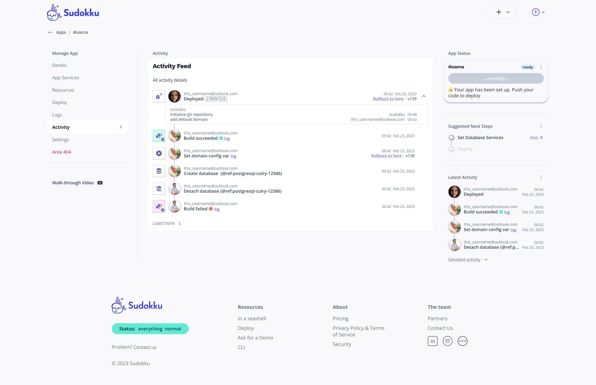
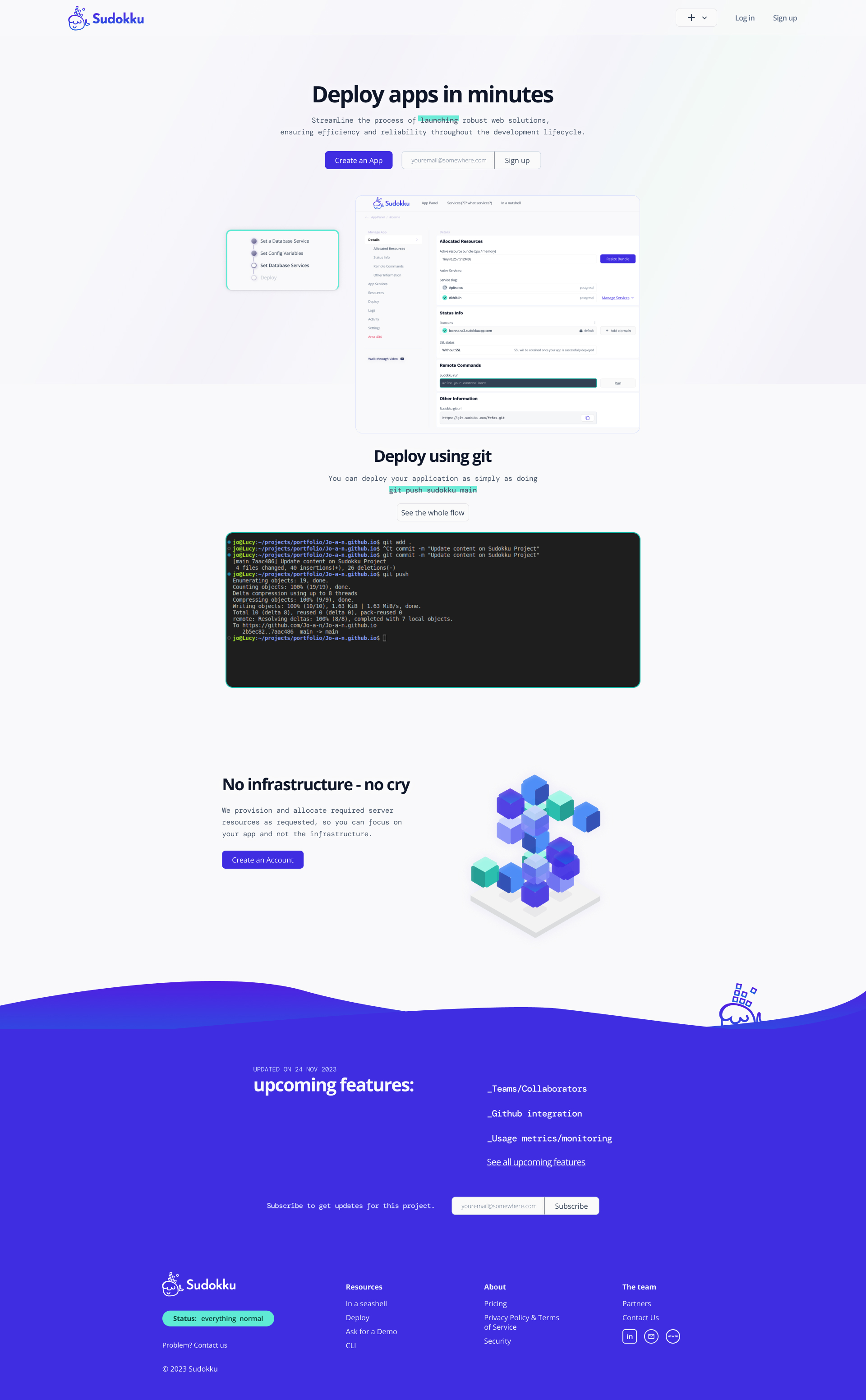
Below, you can see some app screens from the latest design iteration.
The project is currently under user research, testing & design iterations. More to be uploaded soon :)


More to be uploaded soon :)